Have you ever held a craft beer can in your hand and wondered who came up with the artwork? Cincinnati has more than 35 breweries and about half of them bottle and can their beers for distribution. And in the ever-saturating market of cool craft beers, not only does taste matter but so does design — especially if you’re trying to grab shoppers’ eyes in stores or taprooms.
Here are some local breweries that have their identities well thought out, crafting cans to create maximum visual impact and weave stories for current — and future — fans of their artful brews.
Rhinegeist
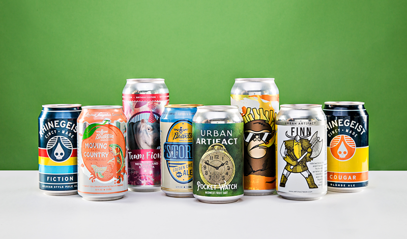
In 2017, Rhinegeist created around 90 different labels for their drafts, bombers and cans. Their design method is simple: place their skull logo front and center with the name and type of beer in lettering below, then surround it with multi-colored stripes or fill the entire can with one color.
“The clean, distinctive look comes from a desire to create something timeless that would also stand out among the visual clutter at the craft beer shelf,” says Greg Althoff, Rhinegeist’s creative director. “Since we do release quite a large number of beers in a year, we wanted to have a packaging system that is relatively easy to update and maintain as well.”
The pink cans of the brewery’s rosé ale Bubbles parallel the pink color of the cider beer, and hoppy ale Dad features a tartan print plaid — a pattern that evokes something a father would wear.
“Sometimes, we use color combinations to represent the flavor profile,” Althoff says. “Other times, like in the case of Dad or Andromeda (with a galactic blue theme), we push the artwork to support a concept.”
Braxton
Braxton takes a similar approach with their cans. Keith Neltner of local Neltner Small Batch designed the original can of Storm, a golden cream ale. “We wanted to do something classic but clean,” says Jonathan Gandolf, Braxton’s chief marketing officer; Covington neighbor Durham Brand & Co. now does the graphics.
Braxton’s core lineup of cans are color coded — Storm is blue, Dead Blow has a greyish tint — and feature a large oval emblem in the middle with the name of the brew and Braxton’s logo: an eagle with a body made of hops.
“We do try to maintain the same hierarchy throughout all of our cans,” Gandolf says. “This will help us shelf block when they’re all in the store together.”
Urban Artifact
Whereas Rhinegeist and Braxton employ a more fundamental concept, every can of Urban Artifact beer has a narrative behind the hand-drawn label. In 2016, the brewery started canning its wild-caught yeast beers and tasked Scott Hand, an architect who helped design and construct the Northside brewery/taproom, with helping to create the labels.
“Our beer names are all versions of artifacts — either items, jobs, fossils, etc.,” Hand says. “And we like the label to have a memorable visual representation of that word.” For instance, Keypunch, a seasonal gose made from key limes, is named after a female punch-card-machine operator from the 1960s.
“We decided that we liked the idea that the perennial beers and goses would all have characters that represent the beer names,” Hand says. “Some are a bit more cartoonish, but hopefully rooted in the history of the name.”
For instance, Leonardo da Vinci’s sketchbook contained a rendering of a flying machine based on a whirling motion (basically a primitive helicopter), which inspired the drawing on the label for the blueberry-flavored Whirligig beer. Hand says the background of three different blue watercolor washes complements the blue-hued beer, made with fresh blueberries. “The swirling blues are really what pull the flavor onto the aesthetics,” he says.
Depending on the idea, it takes Hand anywhere from 10 hours to a week to complete a draft of a label. He generates the sketches using a felt-tipped pen and paper and then scans them into a computer.
Scott Hunter, Urban Artifact’s co-founder and chief of strategic development, and Bret Kollmann Baker, co-founder and chief of brewing operations, also contribute to the ideas. Hand gets to work before the beer has finished brewing — unless it’s a barrel-aged beer — but they talk through the flavor profile, fruits and concept before he starts, he says. Like Rhinegeist, they produced more than 90 different labels in 2017.
Listermann/Triple Digit
Five years ago, Listermann/Triple Digit tapped Hamilton design company LemonGrenade Creative to conceptualize the brewery’s 16-ounce four-packs of cans, bottle labels and tap stickers. In August, they redesigned the brewery’s logo.
Every month, Listermann releases quirky new cans from their Hip Hop and animal-inspired New England-style IPA series. The brewery and the design firm spitball ideas back and forth. “Usually they provide the name of the beer and we present concepts,” says Thommy Long, LemonGrenade’s creative director. “For example, for their peanut porter called Nutcase, I quickly sketched a peanut in a straight jacket and they loved the idea and they have been using it ever since.”
For the East Coast Hip Hop line, Listermann will send LemonGrenade a photo of rappers and they’ll superimpose hops (get it?) over the faces, like with the beer Biggie (named after The Notorious B.I.G.).
“When we rebranded Listermann, we made the artwork the most dominant part of the label,” Long says. “Even the brewery name is on the side of the label, so it is all about the art.”
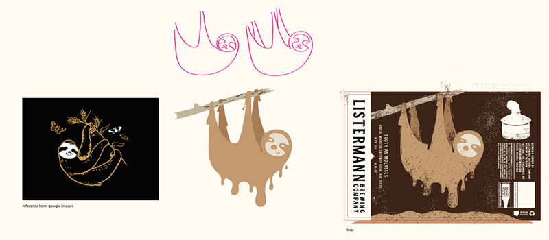
The team at LemonGrenade sometimes hand sketches the art, such as for the can design for Brass Monkey and Slow As Molasses imperial oatmeal stout, which features a sloth hanging from a tree.
However, Listermann’s most famous line of cans feature the Cincinnati Zoo’s princess of the people: Fiona the hippo. Since last summer, Listermann has released several limited-edition brews named after the photogenic cutie including Team Fiona and variants Team Fiona: Bifi, DDH Team Fiona and Team Fiona: Birthday, for her first birthday. On Birthday’s can, there’s a photo of her donning a superimposed party hat. During Fiona can releases, there are lines out the taproom door of fans trying to get their hands on a pack.
“I could’ve hand drawn those labels and they would’ve sold just as fast,” says Listermann’s general manager Jason Brewer (who is not an artist).
The zoo series isn’t limited to just Fiona, though — Listermann brewed a black IPA named after Kendi, the zoo’s new black rhino calf. The zoo provides the photos of the animals and LemonGrenade adds colors based on them; Kendi has accents of gray and black on the can and Fiona brews are usually tinted with hues of pink and purple.
Besides zoo animals, Listermann has also released cans with photos of employees’ pets on them. Hank the Dumpster Kitty IPA is based on a kitten they found in the brewery’s dumpster. Babycat Meowface double IPA was a bit of a challenge for the firm because they only had a blurry iPhone image to work with. “We turned a boring photo into a Die Hard-ish type movie poster,” Long says.
Listermann doesn’t have a huge marketing budget, so every label needs to count, Brewer says. “It’s gotta be something that we really love for us to say, OK, it’s going to be a can design.”

