Local artist and illustrator Tom Post has often looked to nature for inspiration. So when MadTree Brewing asked him to design the can illustration for a beer called Lift, he turned again to his favorite muse.
“About a month before they asked me, the birds were migrating,” Post says. “I would watch them all the time, flying from tree to tree, heading south.”
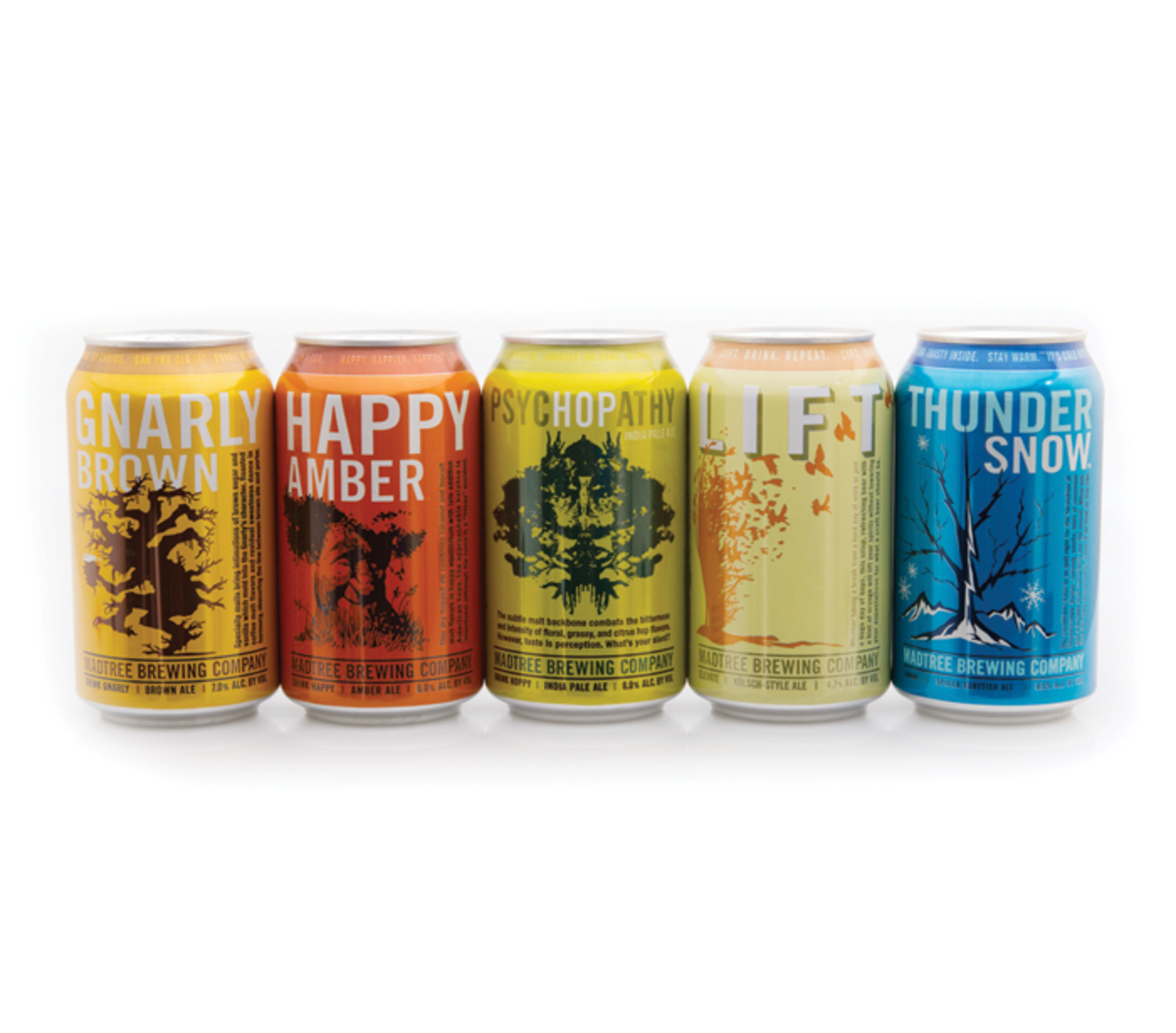
When Post’s longtime friend and MadTree’s packaging designer John Pattison called him about the opportunity, Post’s fascination with avian migration — something he had originally envisioned as a painting — came to life as the yellow and burnt orange design on the now-ubiquitous Lift can. The MadTree logo, a tree, fit in nicely with Post’s vision.
Post is also responsible for the designs on MadTree’s Happy Amber (a smiling ancient tree positioned on a reddish orange can) and The Great PumpCan (a jack-o-lantern formed by the limbs of a gnarled tree on an orange can). His work, along with the work of other local artists, represents a new trend in the craft brewing scene: an increased focus on the aesthetics of the beer can, a concept deemed “can art.”
Why cans?
MadTree has been in the forefront of the craft beer can movement since the brewery began in 2012. Rhinegeist has also caught on to the trend, both in the aesthetic appeal and the use of cans in general. The growing popularity of cans is due in part to their limited accessibility in years past, particularly for smaller breweries.
“Smaller canning lines didn’t exist 10 years ago,” says Bryant Goulding, co-founder and VP of Rhinegeist. “Craft breweries didn’t used to have the resources.”
Goulding, a craft beer connoisseur who spent seven years on the West Coast, also sees cans as better for beer than bottles. “The can is arguably and thoroughly a better product,” he says. “Unlike bottles, cans let less oxygen in during the canning process.”
MadTree’s Pattison agrees, noting that cans have a marketing advantage as well. “Bottles become commoditized and generic without their labels,” he says. “There is something permanent about a can — it’s more of an art form. The cooler the can, the better the chance it’ll end up on a shelf somewhere instead of in the trash.”
In fact, media and branding magazine Adweek recently published a collection of the “coolest-looking” beer cans in America, and MadTree’s Gnarly Brown, designed by Pattison in collaboration with local illustrator Richard Biever, made the list. Paste Magazine produced a similar list, with MadTree’s Happy Amber and a collection of Rhinegeist cans making the cut.
MadTree’s colorful footprint
Pattison’s journey to “cool” is what has helped shape MadTree as an easily recognizable brand. Pattison, with a background in creative design and advertising under his belt, heavily emphasized the unorthodox use of bright colors, an idea that was not exactly popular with some investors initially.
“Everybody thinks you can’t use colors [on beer cans] because it will look like a pop can,” Pattison says. “The thing is, you’re never going to be competing with soft drinks, you’re competing with other beers.”
The colors MadTree uses — chartreuse green for its Psychopathy IPA, bright pink for Sol Drifter blonde ale, the aforementioned pale yellow and burnt orange for Lift — are often based on the fruits used in the beer, the taste of it or even the time of year in which it will be released. Pattison also pushes the use of bold fonts — his advertising background shining through — and more in-your-face backdrops. Prime examples of his vision are two new imperial IPAs, Galaxy High and Citra High, which will both use trippy, colorful backdrops and loud fonts to match the intense, extra hoppy sensory experience in each sip.
Since 2012, MadTree has hired numerous different local artists and illustrators in an attempt to make every can unique. The brewery strives to create an identity for each beer while still maintaining a strong sense of brand. Each artist is given a basic structure with which to work, along with the name of the beer. They do not, Post says, get to taste the beer first.
Artists also have to work with restrictions set by the government. Certain warning labels have to be clearly visible and the UPC scan may not be muddled by the use of color. This slight bureaucracy aside, artists like Post still feel a relative sense of freedom in their design process.
“The creativity part is pretty open-ended,” he says. “You know the spacing, you work with the design [of the can], you think of what would look good in that shape.”
For artists and illustrators like Post, their careers will hopefully blossom through the endless exposure these drinkable works of art provide. Each beer can they design features their signature: a truly mobile work of art.
Rhinegeist’s design formula
Rhinegeist shares a focus on color and brightness. The brewery’s cans all feature the same basic structure, complete with clean lines, block coloring and the brewery’s unique icon: the “skull drop,” a skull in the shape of a raindrop. With help from freelance designer Tara Hush, Rhinegeist applies its plug-and-play design to make each can different.
“With our seasonal beers, we were running out of colors in the Crayola box,” Goulding says. “For our beers that are more briefly available, we started playing with patterns.”
For the company’s Oktoberfest style beer, Franz, they implemented a Bavarian flag on the bottom half of the can. For the Porter style, Panther, they applied a tuxedo motif. And for the holiday beer, Dad, Goulding and his team drew inspiration from their own childhoods.
“When you distill the holidays down, what’s important is family,” Goulding says. “When I think of the holidays, I think of my dad in his plaid pajamas on Christmas morning.”
So the bottom of the can was decked in red and green plaid.
The skull drop has become as recognizable a symbol as any in the local beer scene, featured prominently on cans and the company’s T-shirts and hoodies. The symbol was conceived by Helms Workshop out of Austin, Texas; its intention to call to mind the rich history behind Rhinegeist’s century-old building, a former Christian Moerlein bottling plant on Elm Street in Over-the-Rhine.
Bringing people back
Above all else, both breweries want to keep brewing the kind of beer that brings people back, and memorable packaging certainly helps their case. MadTree uses a unique artistic rendering for each beer; Rhinegeist’s people frequently add funny hashtags to the bottom of cans, such as stamping their Truth IPA with #youcanthandlethetruth.
“JD Erickson, our packaging manager, has a good sense of humor,” Goulding says, “and the bottom of the can is the blank page for his poetry. #wisdombeneath.”
These types of details demonstrate an authenticity that helps connect each brand with the growing number of craft beer enthusiasts.
“There are 3,000 breweries in America right now,” Goulding says. “You must stand out. Forethought into design is an indicator of quality.”
Pattison agrees. “People who love craft beer fall in love with the can as much as the beer,” he says. “If the beer is really good, they will fall in love with it from the inside out.” ©